Components Steppers

Steppers

Steppers convey progress through numbered steps.

Steppers display progress through a sequence of logical and numbered steps. They may also be used for navigation.

Steppers may display a transient feedback message after a step is saved.

Types of Steps

Editable
Non-editable
Mobile
Optional

Types of Steppers

Horizontal
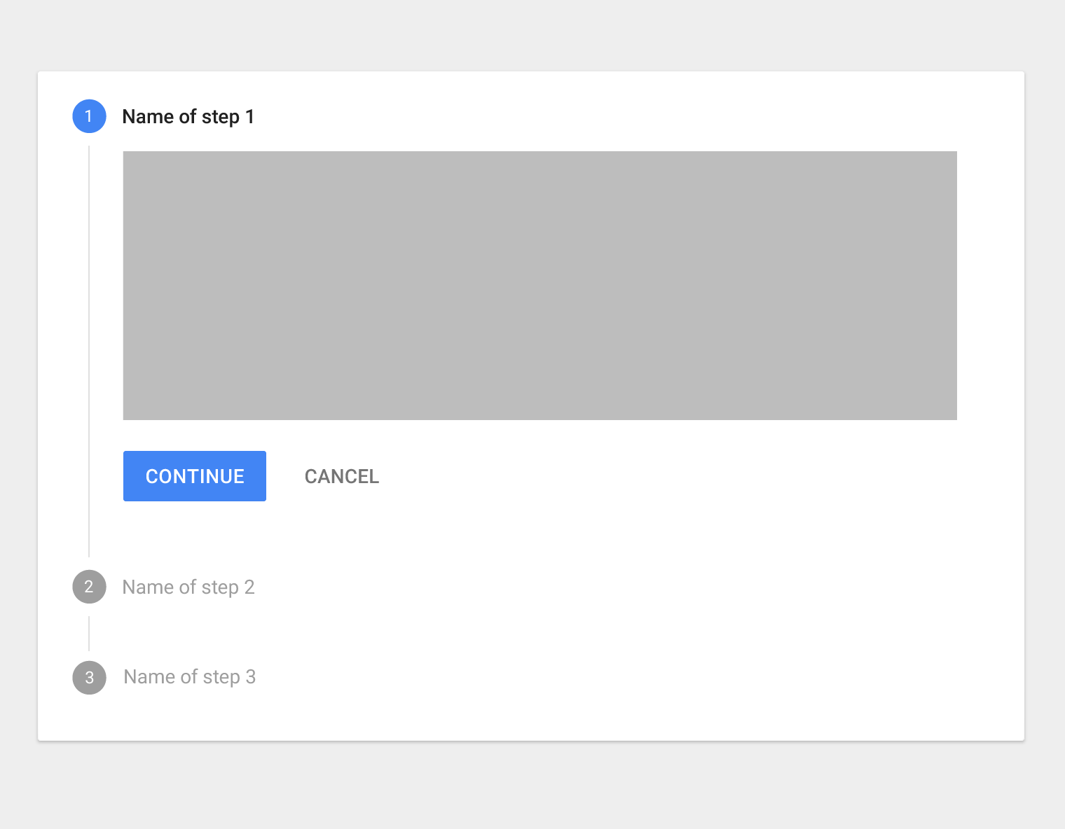
Vertical
Linear
Non-linear

Usage Expand and collapse content An arrow that points down when collapsed and points up when expanded.

Steppers display progress through a sequence by breaking it up into multiple logical and numbered steps.

Steppers should be used when a field determines a subsequent field.

Active stepper circle

  • 24dp x 24dp
  • 12sp Roboto Regular
  • Inherits primary color
  • Default color is Google Blue 500

Active step

  • 14sp Roboto Medium
  • 87% black

Connector line

  • 1dp border
  • Grey 400 color value

Inactive stepper circle

  • 24dp x 24dp
  • 12sp Roboto Regular
  • 100% white
  • 38% black

Inactive steps

  • 14sp Roboto Regular
  • 38% black

Avoid using steppers to break up sections in a short form, or multiple times on one page.

Don’t.

Don’t embed steppers within steppers or use multiple steppers on one page.

Types of steps Expand and collapse content An arrow that points down when collapsed and points up when expanded.

Editable steps

Editable steps allow users to return later to edit a step. These are ideal for workflows that involve editing steps within a session.

Editable steps can be edited within a session.

Non-editable steps

Non-editable steps should be used when:

  • Users cannot edit a step later
  • Step editing poses a distraction risk to form completion

Non-editable steps cannot be edited once completed.

Mobile steps

Mobile step text

Steps displayed at the top in text

Mobile step dots

Use dots when the number of steps isn’t large.

Mobile step progress bar

Use a progress bar when there are many steps, or if there are steps that need to be inserted during the process (based on responses to earlier steps).

Optional steps

Optional steps within a linear flow should be marked as optional.

Mark optional steps in linear flows as optional.

Optional steps

  • 12sp Roboto Regular
  • 54% black

Types of steppers Expand and collapse content An arrow that points down when collapsed and points up when expanded.

Horizontal steppers

Horizontal steppers are ideal when the contents of one step depend on an earlier step.

Avoid using long step names in horizontal steppers.

On horizontal steppers, the step name and numbers appear on a horizontal bar, which can be fixed to the top of the page when scrolling down.

Vertical steppers

Vertical steppers are designed for narrow screen sizes. They are ideal for mobile.

Vertical steppers can be used in mobile as-is. Simply ensure that the contents for each step are responsive.

Linear steppers

Linear steppers require users to complete one step in order to move on to the next.

Each linear step must be completed before proceeding to the next one.

Non-linear steppers

Non-linear steppers allow users to enter a multi-step flow at any point.

Non-linear steps may be completed in any order.

Inactive stepper circle

  • 24dp x 24dp
  • 12sp Roboto Regular
  • Text 100% white
  • 38% black

Inactive steps

  • 14sp Roboto Regular
  • 54% black

Alternative labels

Alternative label placement

Alternative label placement with an optional step

Stepper feedback

Steppers may display a transient feedback message after a step is saved. Stepper feedback should only be used if there is a long latency between steps.

This stepper displays a transient feedback message after a step is saved.

Specs Expand and collapse content An arrow that points down when collapsed and points up when expanded.

Standard stepper

Step height: 72dp
Icon top, bottom, and left padding: 24dp
Icon right padding: 8dp

Optional step

Step height: 72dp
Icon left and right padding: 8dp
Label right padding: 8dp

Multi-line error state

Alternative label

Step height: 104dp

Icon left and right padding: 8dp
Label top padding: 16dp
Icon and label padding from edge: 24dp

Alternative label placement with optional step

Icon left and right padding: 8dp
Step left and right padding: 16dp
Label bottom padding: 24dp

Icon and label padding from screen edge: 24dp

Alternate label placement error state

Non-linear steppers

Hover and pressed states

Hover

Hover

Pressed

Pressed

Background

  • 6% black

Stepper circle

  • 24dp x 24dp
  • 12sp Roboto Regular
  • Text 100% white
  • 38% black

Vertical steppers

Vertical stepper, with sub-steps
Icon left padding: 24dp
Icon alignment with label: Center vertical
Icon top and bottom padding: 8dp
Label top padding: 24dp
Label bottom padding: 16dp
Vertical space between steps: 48dp
Button height: 48dp
Button top padding: 16dp

Example of a vertical stepper

Mobile steppers

Icon top and bottom padding: 8dp
Label top padding: 24dp
Label button padding (no sublabel): 16dp
Vertical space below inactive step: 40dp
Vertical space below active step: 48dp
Button height: 48dp