Components Lists

Lists

Lists present multiple line items vertically as a single continuous element.

Lists are made up of a continuous column of rows. Each row contains a tile. Primary actions fill the tile, and supplemental actions are represented by icons and text.

Lists are best suited for similar data types.

Actions

Vertical scrolling
Filtering and sorting

Gestures

Swipe
Drag and drop

Alternatives

Cards
Grid lists

Usage Expand and collapse content An arrow that points down when collapsed and points up when expanded.

A list consists of a single continuous column of tessellated sub-divisions of equal width called rows that function as containers for tiles.

Tiles hold content, and can vary in height within a list.

List

Row and tile

Lists are best suited to presenting a homogeneous data type or sets of data types, such as images and text. They are optimized for reading comprehension while differentiating either between similar data types, or qualities within a single data type.

List alternatives:

  • If more than three lines of text need to be shown in list tiles, use cards instead
  • If the primary distinguishing content consists of images, use a grid list

Density

When the mouse and keyboard are the primary input methods, measurements may be condensed to accommodate denser layouts.

Typical list scanning pattern

Behavior Expand and collapse content An arrow that points down when collapsed and points up when expanded.

Scrolling

Lists scroll only vertically.

Gestures

The swipe action of each tile should be consistent within lists.

Tiles may be moved between a list and drop target (similar to moving a file into a folder) and picked up and manually reordered within a list.

Filtering and sorting

List tiles can be sorted or filtered by date, file size, alphabetical order, or other parameters.

Do.

Alphabetical sorting makes information easier to find.

Don’t.

Don’t display information in random order; if the UI doesn’t allow the user to sort a list, your app should use a logical sort order.

Content Expand and collapse content An arrow that points down when collapsed and points up when expanded.

Collections of list tiles present related content in a consistent format. Lists use hierarchy to prioritize a type or set of content, which helps users find the most important information. For example, in an email inbox app, an avatar and text snippet are emphasized over a time stamp.

List tiles may contain up to three lines of text, and text length may vary between tiles in the same list. To display more than three lines of text, use a card.

Place the most distinguishing content on the left of the tile and the least distinguishing content on the right.

Specifications:

  • The majority of space on a list tile should be dedicated to the primary action
  • Place the most distinguishing content towards the left of the tile
  • In tiles with multi-line content, place the most distinguishing content in the first line
  • Place supplemental actions on the right side

The primary action takes up the majority of the space on the tile. The supplemental action goes on the right side of the tile.

Actions Expand and collapse content An arrow that points down when collapsed and points up when expanded.

Primary and supplemental actions (such as play, zoom in, delete, and select) may open a subsequent view, such as a card. They do not have a submenu or an action overflow menu.

Primary actions

  • Fill the entire tile and are not represented solely by an individual icon or text button
  • Are consistent for all tiles in a specific list, such as the primary action in a list of music to play songs

Supplemental actions

  • Are represented by icons, secondary text, etc
  • Have consistent functionality throughout a list, such as an icon that indicates if someone is online
  • Have a consistent location in a list’s tiles

Repeating actions

Avoid displaying a repeated supplemental action in tiles, such as a share action in every tile.

Toggles, such as stars or pins, are exceptions because they provide unique information about each individual tile.

Specs Expand and collapse content An arrow that points down when collapsed and points up when expanded.

In a single-line list, each tile contains a single line of text. The amount of text can vary between tiles within the same list.

Single-line list specs
Icon left padding: 16dp
List item left padding: 72dp
List item right padding: 16dp

Example of a single-line list

In a two-line list, each tile contains a maximum of two lines of text. The amount of text can vary between tiles within the same list.

Two-line list specs
Icon left padding: 16dp
List item left padding: 72dp
List right padding: 16dp

Example of a two-line list

In a three-line list, each tile contains a maximum of three lines of text.

The amount of text can vary between tiles within the same list.

Three-line list specs
Icon left padding: 16dp
List item left padding: 72dp
List right padding: 16dp

Example of a three-line list

Single-line list

Text only

Add 8dp of padding at the top and bottom of a list, except for lists with subheaders, which have their own padding.

Bottom padding is measured from the baseline.

Single-line list

Example of a single-line list

Single-line list specs

Font: Roboto Regular 16sp
Height: 48dp
Left and right padding from screen edge: 16dp
Top padding: 8dp

Dense single-line list specs

Font: Roboto Regular 13sp
Height: 40dp
Left and right padding from screen edge: 16dp
Top padding: 4dp

Icon with text

Add 8dp of padding at the top and bottom of a list, except for lists with subheaders, which have their own padding.

Bottom padding is measured from the baseline.

Single-line list with icon

Example of a single-line list with icon

Single-line list with icon specs

Font: Roboto Regular 16sp
Height: 48dp
Icon padding, left: 16dp
Text padding, left: 72dp
Top padding: 8dp

Dense single-line list with icon specs

Font: Roboto Regular 13sp
Height: 40dp
Icon padding, left: 16dp
Text padding, left: 72dp
Top padding: 4dp

Avatar with text

Bottom padding is measured from the baseline.

Add 8dp of padding at the top and bottom of a list, except for lists with subheaders, which have their own padding.

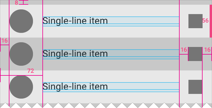
Single-line item with avatar

Example of a single-line item with avatar

Single-line item with avatar specs

Font: Roboto Regular 16sp
Height: 56dp
Left avatar padding: 16dp
Text padding, left: 72dp
Top padding: 8dp

Dense single-line item with avatar specs

Font: Roboto Regular 13sp
Height: 48dp
Left avatar padding: 16dp
Text padding, left: 72dp
Top padding: 4dp

Avatar with text and icon

Right icon padding: 16dp

Add 8dp of padding at the top and bottom of a list, except for lists with subheaders, which have their own padding.

Bottom padding is measured from the baseline.

Single-line item with avatar and icon

Example of a single-line item with avatar and icon

Single-line item with avatar and icon specs

Font: Roboto Regular 16sp
Height: 56dp
Left avatar padding: 16dp
Right icon padding: 16dp
Text padding, left: 72dp
Top padding: 8dp

Dense single-line item with avatar and icon specs

Font: Roboto Regular 13sp
Height: 48dp
Left avatar padding: 16dp
Right icon padding: 16dp
Text padding, left: 72dp
Top padding: 4dp

Two-line list

Text only

Primary text font: Roboto Regular 16sp
Secondary text font: Roboto Regular 14sp
Tile height: 72dp
Text padding, left: 16dp
Text padding, top and bottom: 20dp

Bottom padding is measured from the baseline.

Add 8dp of padding at the top and bottom of a list. One exception is at the top of a list with a subheader, because subheaders contain their own padding.

Two-line list

Example of a two-line list

Two-line list specs:

Font: Roboto Regular 16sp
Height: 72dp
Left and right padding from screen edge: 16dp
Top padding: 8dp

Dense two-line list specs:

Font: Roboto Regular 13sp
Height: 60dp
Left and right padding from screen edge: 16dp
Top padding: 4dp

Icon with text

Primary text font: Roboto Regular 16sp
Secondary text font: Roboto Regular 14sp
Tile height: 72dp
Left icon padding: 16dp
Text padding, left: 72dp
Text padding, top and bottom: 20dp
Bottom padding is measured from the baseline.

Add 8dp of padding at the top and bottom of a list, except for lists with subheaders, which have their own padding.

Two-line list with icon

Example of a two-line list with icon

Two-line list with icon specs:

Font: Roboto Regular 16sp
Height: 72dp
Icon left padding: 16dp
Text left padding: 72dp
Padding above list: 8dp
Text right padding: 16dp

Dense two-line list with icon specs:

Font: Roboto Regular 13sp
Tile height: 60dp
Icon left padding: 16dp
Text left padding: 72dp
Padding above list: 4dp
Text right padding: 16dp

Avatar with text

Primary text font: Roboto Regular 16sp
Secondary text font: Roboto Regular 14sp
Tile height: 72dp
Left avatar padding: 16dp
Text padding, left: 72dp
Text padding, top and bottom: 20dp

Bottom padding is measured from the baseline.

Center-align icon with text area.

Add 8dp of padding at the top and bottom of a list, except for lists with subheaders, which have their own padding.

Two-line list with avatar

Example of a two-line list with avatar

Two-line list with avatar specs:

Font: Roboto Regular 16sp
Tile height: 72dp
Icon left padding: 16dp
Text left padding: 72dp
Padding above list: 8dp
Text right padding: 16dp

Dense two-line list with avatar specs:

Font: Roboto Regular 13sp
Tile height: 60dp
Icon left padding: 16dp
Text left padding: 72dp
Padding above list: 4dp
Text right padding: 16dp

Avatar with text and icon

Primary text font: Roboto Regular 16sp
Secondary text font: Roboto Regular 14sp
Tile height: 72dp
Left avatar padding: 16dp
Text padding, left: 72dp

Right icon padding: 16dp

Bottom padding is measured from the baseline.

Add 8dp of padding at the top and bottom of a list, except for lists with subheaders, which have their own padding.

Avatar with text and icon

Example of an avatar with text and icon

Avatar with text and icon

Font: Roboto Regular 16sp
Tile height: 72dp
Icon left padding: 16dp
Text left padding: 72dp
Padding above list: 8dp
Text right padding: 16dp

Dense avatar with text and icon

Font: Roboto Regular 13sp
Tile height: 60dp
Icon left padding: 16dp
Text left padding: 72dp
Padding above list: 4dp
Text right padding: 16dp

Three-line list

Text only

Primary text font: Roboto Regular 16sp

Secondary text font: Roboto Regular 14sp
Tile height: 88dp
Text padding, left: 16dp
Text padding, top: 16dp
Text padding, bottom: 20dp

Bottom padding is measured from the baseline.

Add 8dp of padding at the top and bottom of a list, except for lists with subheaders, which have their own padding.

Three-line list

Example of a three-line list

Three-line list specs:

Font: Roboto Regular 16sp
Tile height: 88dp
Text left padding: 16dp
Text right padding: 16dp
Padding above list: 8dp

Dense three-line list specs:

Font: Roboto Regular 13sp
Tile height: 76dp
Text left padding: 16dp
Text right padding: 16dp
Padding above list: 4dp

Icon with text

Primary text font: Roboto Regular 16sp
Secondary text font: Roboto Regular 14sp
Tile height: 88dp
Left icon padding: 16dp
Text left padding: 72dp
Text padding, top: 16dp
Text padding, bottom: 20dp

Bottom padding is measured from the baseline.

Top-align icon with primary text.

Add 8dp of padding at the top and bottom of a list, except for lists with subheaders, which have their own padding.

Three-line list with icon

Example of a three-line list with icon

Three-line list with icon specs:

Font: Roboto Regular 16sp
Tile height: 88dp
Icon left padding: 16dp
Text left padding: 72dp
Text padding right: 16dp
Padding above list: 8dp

Dense three-line list with icon specs:

Font: Roboto Regular 13sp
Tile height: 76dp
Icon left padding: 16dp
Text left padding: 72dp
Text padding right: 16dp
Padding above list: 4dp

Avatar with text

Primary text font: Roboto Regular 16sp
Secondary text font: Roboto Regular 14sp
Tile height: 88dp
Left avatar padding: 16dp
Left text padding: 72dp
Text padding, top: 16dp
Text padding, bottom: 20dp

Bottom padding is measured from the baseline.

Top-align avatar with primary text.

Add 8dp of padding at the top and bottom of a list, except for lists with subheaders, which have their own padding.

Three-line list with avatar

Example of a three-line list with avatar

Three-line list with avatar specs:

Font: Roboto Regular 16sp
Tile height: 88dp
Padding above list: 8dp
Padding left of avatar: 16dp
Text left padding: 72dp
Text right padding: 16dp

Dense three-line list with avatar specs:

Font: Roboto Regular 13sp
Tile height: 76dp
Padding above list: 4dp
Padding left of avatar: 16dp
Text left padding: 72dp
Text right padding: 16dp

Avatar with text and icon

Primary text font: Roboto Regular 16sp
Secondary text font: Roboto Regular 14sp
Tile height: 88dp
Left avatar padding: 16dp
Text left padding: 72dp
Text padding, top: 16dp
Text padding, bottom: 20dp

Right icon padding: 16dp

Bottom padding is measured from the baseline.

Top-align avatar and icon with primary text.

Add 8dp of padding at the top and bottom of a list, except for lists with subheaders, which have their own padding.

Three-line list with avatar and icon

Example of a three-line list with avatar and icon


Three-line list with avatar and icon specs:

Font: Roboto Regular 16sp
Tile height: 88dp
Left avatar padding: 16dp
Text left padding: 72dp
Padding above list: 8dp
Right and left padding by the icon: 16dp

Dense three-line list with avatar and icon specs:

Font: Roboto Regular 13sp
Tile height: 76dp
Left avatar padding: 16dp
Text left padding: 72dp
Padding above list: 4dp
Right and left padding by the icon: 16dp